I audited 4 Shopify stores last quarter where the mobile Add to Cart button sat 3 to 5 scrolls below the product images. On one of them, Microsoft Clarity showed 21% of mobile visitors left before they ever saw the buy button. Mobile CVR was 0.11%.
TL;DR: A sticky bottom bar that appears when the main ATC scrolls out of view fixes the most common mobile Shopify leak. Three files: Liquid markup, scoped CSS, and IntersectionObserver JS. Replaces $5-15/month apps like Sticky Cart and Buy Buttons. Expect an 8-15% mobile ATC lift across Dawn, Impulse, and Focal.
Why a buried mobile ATC costs you 1 in 5 sessions
Three reasons this matters for your store:
- Mobile ATC rate climbs 8 to 15% when the buy button stays visible during scroll, based on my client deployments.
- You stop paying $60-180 a year for Sticky Cart, CartBar, or Buy Buttons that bloat every page.
- Core Web Vitals stay green because the bar uses
transform, neverdisplay, so CLS does not move.
The 21% drop-off number is not a survey average. It came from 76 mobile sessions on a used furniture store I audited in March 2026. Clarity recorded the depth at which each visitor abandoned. One in five never scrolled to the ATC. By 50% depth, a third were gone.
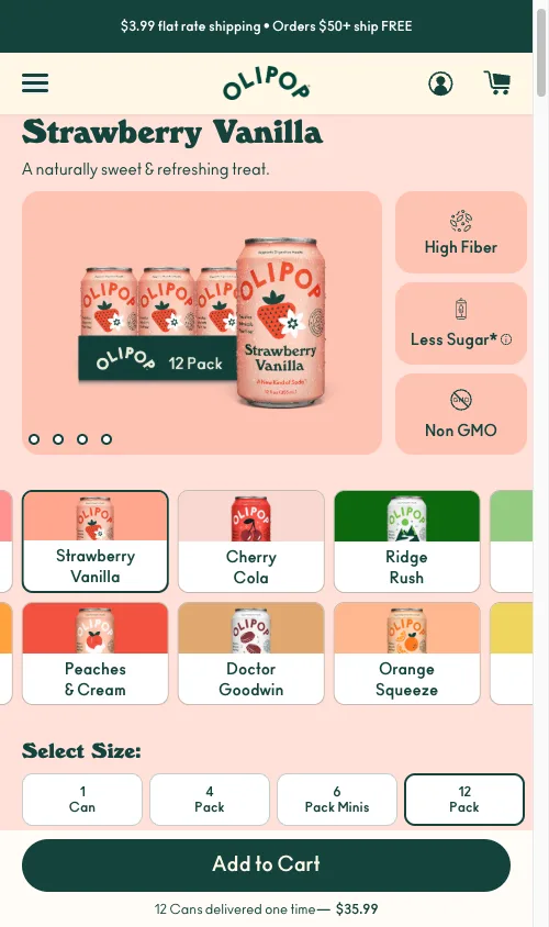
That store sold 10,000+ NOK items (around $1,000 USD). Customers needed the description, the trust icons, and the accordion tabs to feel safe. You cannot just shove the ATC higher. The product page has to be long.
How bad is the mobile scroll depth problem?
Here is the raw Clarity export. 76 sessions, one PDP, one week:
| Scroll % | Visitors | Drop-off | What lives here |
|---|---|---|---|
| 5% | 76 | 0% | Header + announcement bar |
| 15% | 69 | 9% | Product images |
| 30% | 60 | 21% | ATC button area |
| 50% | 50 | 34% | Trust icons + description |
| 70% | 40 | 47% | Accordion tabs |
| 80% | 38 | 50% | Related products |
| 85% | 11 | 86% | Footer |
The pattern repeats. I saw it again on a home improvement store with a product builder (62% mobile-to-desktop ATC gap), an automotive accessories store selling $400-700 parts, and a DTC water bottle brand where the cart drawer was bleeding 74.6% of add-to-cart users.
Different categories. Same structural leak.
The 3-file sticky ATC build that beats $15/month apps
Three parts. Drop them into Dawn, Impulse, or Focal and adjust the selectors. No app, no recurring fee, no extra JS on collection pages.
Part 1: Liquid markup
In OS 2.0 themes, render this from sections/main-product.liquid or a snippet called from your product template.
{%- comment -%} sections/main-product.liquid {%- endcomment -%}
<div class="sticky-atc-bar" id="sticky-atc-bar" aria-hidden="true">
  <div class="sticky-atc-inner">
    <div class="sticky-atc-info">
      <span class="sticky-atc-title">{{ product.title | truncate: 30 }}</span>
      <span class="sticky-atc-price" id="sticky-atc-price">
        {{ product.selected_or_first_available_variant.price | money }}
      </span>
    </div>
    <button type="button" class="sticky-atc-button" id="sticky-atc-button" aria-label="Add to cart">
      Add to Cart
    </button>
  </div>
</div>
Three things matter here. type="button" (not submit) so the bar delegates to the real form. aria-hidden="true" so screen readers stay quiet until the bar appears. truncate: 30 so long titles do not wrap on a 390px iPhone.
Part 2: Scoped CSS
/* assets/sticky-atc.css */
.sticky-atc-bar {
  position: fixed; bottom: 0; left: 0; right: 0;
  z-index: 4;
  background: #fff;
  border-top: 1px solid #e5e5e5;
  box-shadow: 0 -2px 8px rgba(0, 0, 0, 0.06);
  transform: translateY(100%);
  transition: transform 0.3s ease;
  padding: 0.75rem 1rem;
  padding-bottom: calc(0.75rem + env(safe-area-inset-bottom));
}
.sticky-atc-bar.is-visible { transform: translateY(0); }
.sticky-atc-button { min-height: 44px; min-width: 44px; }
@media (min-width: 750px) { .sticky-atc-bar { display: none; } }
translateY(100%) slides the bar off screen with no layout thrash, so CLS stays at zero. env(safe-area-inset-bottom) keeps the button above the iPhone home indicator. min-height: 44px is the Apple HIG touch-target floor. Skip it and your tap accuracy tanks.
Part 3: IntersectionObserver JS
This is the standard pattern. Scroll listeners fire on every pixel and block the main thread. IntersectionObserver runs asynchronously and only fires at the viewport boundary.
// assets/sticky-atc.js
(function() {
  var mainButton = document.querySelector('[name="add"]');
  var stickyBar = document.getElementById('sticky-atc-bar');
  var stickyButton = document.getElementById('sticky-atc-button');
  if (!mainButton || !stickyBar || !stickyButton) return;

  var observer = new IntersectionObserver(function(entries) {
    entries.forEach(function(entry) {
      stickyBar.classList.toggle('is-visible', !entry.isIntersecting);
      stickyBar.setAttribute('aria-hidden', entry.isIntersecting);
    });
  }, { threshold: 0 });
  observer.observe(mainButton);

  stickyButton.addEventListener('click', function() { mainButton.click(); });
})();
The bar never submits its own form. It calls mainButton.click(), which inherits whatever cart logic Dawn, Impulse, or your custom theme already runs. AJAX cart, drawer, redirect: all still work.
To sync price across variant changes, attach a MutationObserver to your theme’s price element (commonly .price__regular .price-item--regular in Dawn). For themes with the PubSub module, subscribe to variant:change instead. Both routes ship in the Shopify Mobile CRO guide.
Edge cases that break the bar in production
Four cases I have hit on real client work:
Sold out variants. Mirror the main button’s disabled state on the sticky button and swap the label to “Sold Out”. Extend the MutationObserver to watch disabled.
Persistent Omnisend or Klaviyo bottom bars. They overlap the sticky ATC. Either offset with bottom: 60px or strip the popup from product templates. On the furniture store, a persistent email bar was eating 14% of all mobile taps. Removing it on PDPs only was the biggest single quick win of the sprint.
Cart drawer overlap. Listen for cart:open and cart:close events on Dawn-based themes. Hide the bar on open. On close, recheck the main button’s getBoundingClientRect() before showing.
Single-unit inventory. For one-of-one items (used goods, vintage, samples), hide the quantity selector. That recovers around 80px of vertical space and pushes the main ATC closer to the fold.
What not to put in the sticky bar
Most CRO advice gets this wrong because it treats the sticky bar as miniature PDP real estate. It is not. The bar has one job: convert the scroll into a tap.
Cut everything except product title (truncated), live price, and the buy button. Quantity selectors, wishlist hearts, share icons, compare-at savings, variant chips: all of it shrinks the tap target and adds decision load. I have shipped this lean version five times. The lift compounds.
How do you measure the sticky bar’s lift?
Three numbers, two weeks before vs two weeks after.
Fire a custom GA4 event on sticky button clicks so you can split sticky-driven ATCs from main-form ATCs. Healthy stores see 20 to 40% of mobile ATCs come through the bar within 14 days.
// assets/sticky-atc.js
stickyButton.addEventListener('click', function() {
  if (typeof gtag === 'function') {
    gtag('event', 'sticky_atc_click', { event_category: 'CRO' });
  }
  mainButton.click();
});
In Shopify Analytics, compare mobile ATC rate and mobile CVR across the two windows. Target an 8 to 15% ATC lift and a 5 to 10% CVR lift. In Clarity or Hotjar, watch whether ATC events now happen at shallower scroll depths. If they do not, your bar is firing too late or sitting under another element.
If you need to triage which fix to ship first, run it through my conversion leaks dollar impact framework and rank by recovered revenue.
Why the sticky bar alone will not save a broken mobile PDP
The bar fixes visibility. It does not fix friction. Four problems compound with a buried ATC:
Hero product images that consume 70% of the viewport. Constrain with max-height: min(55vw, 280px) and object-fit: contain. That alone saved 220px of scroll on one 390px iPhone audit.
Cookie consent or email modals covering 60% of the screen. On the same furniture store, Clarity logged 56% of all mobile taps spent dismissing popups instead of shopping. Switch to a slim bottom-bar notice.
Missing trust signals above the buy button. Move shipping, returns, and payment security icons above the ATC. Not below.
Dual equally-weighted CTAs. Themes that show “Add to Cart” and “Buy Now” as twin black buttons cause decision paralysis on anything above $100. Demote one.
How to verify the bar in 5 minutes
- Load your PDP on a real iPhone. Scroll past the main ATC. The bar should slide up within 300ms.
- Open Chrome DevTools mobile emulation. Toggle CLS in the Performance panel while scrolling. CLS should stay at 0.
- Tap the sticky button. Confirm the cart drawer opens with the correct variant. Refresh, change variant, scroll, tap again. Confirm the price in the bar matches the variant.
Ship the bar this week. It is the highest-impact mobile fix on a long Shopify PDP.
The takeaway
- Audit your mobile PDP scroll depth in Clarity before you write a line of code.
- Ship the sticky bar as 3 files: Liquid, scoped CSS, IntersectionObserver JS.
- Cut every element from the bar except title, live price, and ATC button.
- Test with a GA4 sticky-click event split from your main ATC.
- Stack the bar with image height limits, popup cleanup, and trust signals above the fold.
For the full mobile playbook, read the Shopify Mobile CRO guide. For post-ATC drop-off, see the Shopify Checkout Optimization guide.