

TL;DR: Shopify shipped native color swatches in Winter 2024, and on the product page they work well. They do not render on collection cards, they skip options that are not color without extra setup, and vintage themes miss them. Here is the copy-paste code that fills those gaps, reads the same native swatch data, stays accessible, and adds $0 in subscription and zero extra JavaScript.
A swatch app is the reflex, and for most stores it is the wrong one. Color Swatch King runs from $14.90 a month on the Basic plan to $99.90 on Plus, and Easify puts image and color swatches behind its $19.99 Premium tier. That is a recurring bill for a control your theme can already draw. Shopify’s swatch object has been in Liquid since Winter 2024, and Dawn shipped swatch support in v13.0.0 on January 31, 2024. The building blocks are free. What the apps really sell is the parts Shopify left out, and you can build those yourself.
Does Shopify have native color swatches?
Yes, and you should use them where they fit. Since Editions Winter 2024, Shopify exposes a native swatch object with a color and an image property on every product option value. In a modern theme, you attach a color to each option value (through the color category metafield or a color-pattern metaobject), and the Variant picker block renders it as a circle or a square on the product page. For product-page color swatches, that is genuinely all most stores need, and I tell people to use it.
The honest catch is scope. Shopify’s help doc says swatches work with “a variant connected to color category metafield and related color entries,” so the built-in path is color only. And the swatch shows up in two places: the product-page variant picker, and the collection filter sidebar. It never renders on the product cards themselves.
Where do native swatches fall short?
Three gaps, and they are the three merchants ask me about most.
- Collection cards. Native swatches never render on the product grid. A shopper scanning a collection cannot tell the jacket comes in five colors until they click in. That is the highest-intent swatch placement, and the one Shopify does not ship.
- Options that are not color. Material, finish, or pattern options do not get the easy color-metafield path. You do the metaobject setup by hand or you render them yourself.
- Vintage themes. The Variant picker block is an Online Store 2.0 idea. A store on an older theme gets nothing automatic, and Shopify’s own doc sends those merchants to code edits or a Partner.
Most swatch tutorials get the next part wrong. They rebuild the whole picker from a hand-typed color-name map and ignore that Shopify already stores the swatch. Read the native data first. Only fall back to a map when it is empty.
How do I add color swatches to Shopify without an app?
On a modern theme, the native picker already handles product-page color swatches, so use it there. You render your own picker in two cases: your theme has no native swatches (a vintage or custom theme), or the option is not color. Here is the accessible markup for those cases. It reads the same product_option_value .swatch data (color or image, or nil when nothing is set), built from radio inputs so the browser hands you keyboard support for free.
{%- comment -%} snippets/color-swatch-picker.liquid: accessible swatch markup {%- endcomment -%}
{%- assign color_opt = product.options_with_values | where: 'name', 'Color' | first -%}
{%- if color_opt -%}
<fieldset class="swatch-group">
  <legend>Color: {{ color_opt.selected_value }}</legend>
  {%- for value in color_opt.values -%}
    <label class="swatch{% unless value.available %} swatch--soldout{% endunless %}">
      <input type="radio" class="swatch__input" name="{{ color_opt.name }}-{{ color_opt.position }}"
             value="{{ value | escape }}"{% if value.selected %} checked{% endif %}{% unless value.available %} aria-disabled="true"{% endunless %}>
      <span class="swatch__chip" style="background:{% if value.swatch.color %}{{ value.swatch.color }}{% elsif value.swatch.image %}url({{ value.swatch.image | image_url: width: 48 }}) center/cover{% else %}#ccc{% endif %};"></span>
      <span class="visually-hidden">{{ value | escape }}{% unless value.available %} (sold out){% endunless %}</span>
    </label>
  {%- endfor -%}
</fieldset>
{%- endif -%}
The line that matters is value.swatch.color: it reuses the native data, so you extend Shopify instead of fighting it. Match 'Color' to your option’s exact name (some stores write “Colour”). This is the presentation layer. To make a chip actually switch the variant, match your theme’s variant-picker contract rather than adding a second picker next to the native one. On Dawn that means the radio name uses the option name and position (as the snippet shows), a form attribute pointing at the product form, and inputs that sit inside its <variant-selects> element so its JavaScript reads them. Edit your existing color-option markup into this shape; do not paste a duplicate. Here is the CSS.
/* assets/component-swatches.css */
.swatch { position: relative; display: inline-flex; cursor: pointer; }
.swatch__input { position: absolute; inset: 0; margin: 0; opacity: 0; cursor: pointer; }
.swatch__chip { position: relative; width: 32px; height: 32px; border-radius: 50%; border: 2px solid #ddd; }
.swatch__input:checked + .swatch__chip { border-color: #111; } /* selected: a border, not color alone */
.swatch__input:focus-visible + .swatch__chip { outline: 2px solid #1a73e8; outline-offset: 2px; } /* WCAG 2.4.7 */
.swatch--soldout .swatch__chip::after { content: ""; position: absolute; inset: 0; background: linear-gradient(to top right, transparent 46%, #999 46% 54%, transparent 54%); }
.visually-hidden { position: absolute; width: 1px; height: 1px; overflow: hidden; clip: rect(0 0 0 0); }
How do I show color swatches on collection cards?
This is the gap worth closing, and it is the placement that moves add-to-carts. Drop a snippet into your product-card that loops the color option and prints one chip per value. It reads the same swatch.color, so a store that already set up native swatches gets card swatches for nothing.
{%- comment -%} snippets/card-swatches.liquid: call from your product-card snippet {%- endcomment -%}
{%- assign color_opt = product.options_with_values | where: 'name', 'Color' | first -%}
{%- if color_opt and color_opt.values.size > 1 -%}
  <div class="card-swatches" role="img"
       aria-label="{{ color_opt.values.size }} colors: {{ color_opt.values | join: ', ' | escape }}">
    {%- for value in color_opt.values limit: 6 -%}
      <span class="card-swatch" aria-hidden="true"
            style="background:{% if value.swatch.color %}{{ value.swatch.color }}{% elsif value.swatch.image %}url({{ value.swatch.image | image_url: width: 32 }}) center/cover{% else %}#ccc{% endif %};"></span>
    {%- endfor -%}
    {%- if color_opt.values.size > 6 -%}<span class="card-swatch-more">+{{ color_opt.values.size | minus: 6 }}</span>{%- endif -%}
  </div>
{%- endif -%}
The role="img" with the joined color names keeps this readable to screen readers while the chips stay decorative. When a store has not set up native swatches, value.swatch.color is empty and every chip renders gray. That is where a tiny name-to-hex map earns its place.
{%- comment -%} snippets/swatch-hex.liquid: {% render 'swatch-hex', name: value %} {%- endcomment -%}
{%- assign map = "black:#111111,white:#f6f6f6,navy:#1f2a44,forest green:#2e5e3a,sand:#d9c7a3,charcoal:#36393f" | split: "," -%}
{%- assign hex = "#cccccc" -%}
{%- assign key = name | downcase -%}
{%- for pair in map -%}
  {%- assign kv = pair | split: ":" -%}
  {%- if kv[0] == key -%}{%- assign hex = kv[1] -%}{%- endif -%}
{%- endfor -%}
{{- hex -}}
Swap the #ccc fallback in either snippet for {% render 'swatch-hex', name: value %} and gray chips turn into real colors, no metafield setup required.
How do I make color swatches accessible?
Swatches are a radio group, so build them like one. Three rules, all from WCAG, all skipped by most of the tutorials ranking above this one.
- Wrap the group in a
<fieldset>with a<legend>naming it Color (W3C technique H71). Screen readers then announce “Color, radio group,” and arrow keys move between options for free. - Keep a visible focus ring (WCAG 2.4.7). The CSS above rings the chip on
:focus-visible. - Never signal the selected or sold-out state with color alone (WCAG 1.4.1). Use a border for selected, a diagonal line for sold-out, and a visually hidden color name on every chip.
That last one is the one apps get wrong too. Plenty of swatch apps ship a picker a keyboard user cannot operate, so the subscription does not even buy you accessibility.
Why not just use a color swatch app?
Because you would pay monthly and add page weight for a control your theme can render. Here is the honest side-by-side.
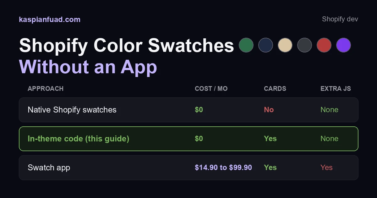
| Approach | Monthly cost | Swatches on collection cards | Extra JavaScript |
|---|---|---|---|
| Native Shopify swatches | $0 | No | None |
| In-theme code (this guide) | $0 | Yes | None |
| Swatch app (e.g. Swatch King) | $14.90 to $99.90 | Yes | Yes |
Color Swatch King has 2,828 reviews and starts at $14.90 a month on Basic, which is real money for a chip. It is also more script on the page. My App Bloat Detector measures the option and personalization apps in this lane at 60 to 170 milliseconds of blocking time each (LimeSpot at 160, Nosto at 170). In-theme swatches add 0. If you need an AI color recommender or bulk variant-image automation, an app earns its keep. For chips on a card, it does not.
Download the Shopify Swatches Setup Checklist (PDF)
How do I verify it works?
Three checks, under five minutes.
- Tab into the swatch group with the keyboard. A focus ring should move chip to chip, and a screen reader should say “Color, radio group.”
- Load a collection page and confirm the chips render under each card, then open a product and confirm its picker matches.
- Run the CrUX grader on that collection before and after. Removing a swatch app should hold or lower your blocking time, never raise it.
This is the same in-theme, no-app approach I use for a size chart and for recently viewed products, and it leans on the same metaobject and metafield data Shopify already gives you.
The takeaway
- Use native swatches for product-page color options. They are free and built in since Winter 2024.
- Build the collection-card swatches yourself. Shopify does not render them, and they are the highest-intent placement.
- Read
product_option_value.swatchfirst, and fall back to a name-to-hex map only when it is empty. - Ship the picker as radio inputs in a fieldset so keyboard and screen-reader users get a real control.
- Skip the $14.90-to-$99-a-month swatch app unless you need its recommender or automation.
I build these in-theme for Shopify clients every month. If you want the swatch setup checked on your own store, my 30-minute migration audit is free.