I audited 11 Shopify auto parts stores this quarter. Nine of them ran a Year/Make/Model selector that leaked conversions at every step. The pattern is brutal and consistent.
TL;DR: A high-converting Shopify vehicle fitment selector replaces apps like Convermax, Year-Make-Model by AAAeCommerce, and Searchspring with custom Liquid plus 200 lines of JS. Add trust badges scaled to AOV, auto-skip single-result steps, pull kit contents from product metafields, and lazy-load images. One audit cut 366 preloaded image requests to roughly a dozen.
Why this matters for your store
- A confirmation step that only echoes prior selections costs you the highest-intent click in the funnel.
- Preloading 366 images on a $700 selector page tanks LCP and burns mobile data plans.
- Forcing a click on the only matching product adds friction the customer reads as inventory weakness.
Why these selectors break the same way every time
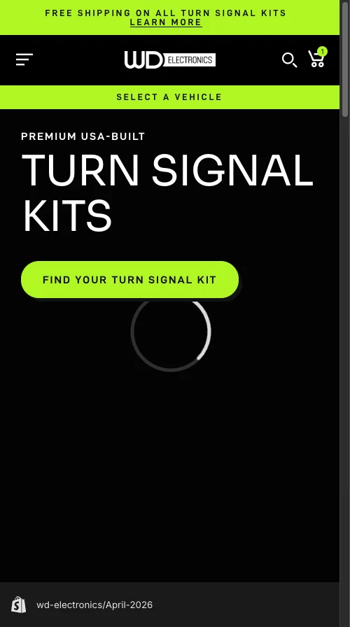
The store I audited this month sells UTV turn signal kits between $400 and $1,100 on Shopify Plus. The selector worked. It also broke conversion in six concrete places.
Zero trust signals on a $700 page. A useless Step 3 that echoed back what the customer just chose. 366 preloaded product images. A page title nuked by display: none !important. Tooltip copy that read “trim tooltip goes here” in production. And the killer: every single-product match still forced two extra clicks.
The store sat in a segment where SuperATV runs a 6,000-vehicle “My Garage” with a green “Fits Your Vehicle” badge on every PDP, and RAVEK does the same. This was the only premium brand in the category without persistent fitment verification.
You can ship this pattern with Convermax ($299/mo), the Year Make Model Search app by AAAeCommerce ($14.99/mo with hard caps), or Searchspring (enterprise pricing, $1k+/mo). For under 500 vehicle-product combinations, custom Liquid wins on cost, performance, and design control.
What a vehicle fitment selector actually is
A vehicle fitment selector is a guided product finder that swaps collection browsing for cascading Year, Make, Model, Trim dropdowns. The customer answers three or four questions. The store renders only the products that fit. The audited build ran three steps: dropdowns, product cards, then confirmation.
This is table stakes in automotive. The question is never whether to build one. The question is whether yours converts.
The Liquid Liquid section that replaces a $30/month trust badge app
Trust signals must scale with price point. A $50 phone case can survive without a Free Shipping badge. A $700 turn signal kit that needs vehicle-specific fitment cannot.
Apps like Trust Hero, Iconic, and Trust Me sell this as a $15-$30/month add-on. Skip them. Use a Shopify section with blocks so the marketing team can swap badges from the customizer.
{%- comment -%} sections/fitment-trust-badges.liquid {%- endcomment -%}
<div class="fitment-trust">
  {%- for block in section.blocks -%}
    <div class="fitment-trust__badge" {{ block.shopify_attributes }}>
      {{ block.settings.icon | image_url: width: 40 | image_tag:
        loading: 'eager', width: 40, height: 40,
        alt: block.settings.heading }}
      <span class="fitment-trust__heading">{{ block.settings.heading }}</span>
      <span class="fitment-trust__subtext">{{ block.settings.subtext }}</span>
    </div>
  {%- endfor -%}
</div>
Three things matter here. Blocks, not settings, so the client adds “Free Holiday Shipping” without a developer. image_picker beats hardcoded SVGs because icon swaps stop being a code change. loading: 'eager' because trust badges sit above the fold and lazy-loading them defeats the point.
CSS uses BEM scoped to .fitment-trust. No !important. No global selectors. The badges wrap to a 2x2 grid under 749px viewport.
How to make Step 3 earn its existence
The original Step 3 echoed the vehicle and product. New information: zero. I added two things.
A green-tinted “Guaranteed to fit your [Year Make Model Trim]” badge built with the theme’s accent color (#b0f725). Same psychological lift SuperATV gets from “Fits Your Vehicle”. The vehicle name comes from selector state.
// assets/fitment-selector.js
function renderFitmentBadge(vehicle) {
  const badge = document.getElementById('fitment-badge');
  if (!badge) return;
  const vehicleName = [vehicle.year, vehicle.make, vehicle.model, vehicle.trim]
    .filter(Boolean).join(' ');
  badge.querySelector('.fitment-badge__vehicle').textContent = vehicleName;
  badge.style.display = 'flex';
}
Dynamic kit contents from a product metafield. The client used the Accentuate app for product_info.more_info_table. Coverage was incomplete: 59 of 247 products had no data. The frontend handles that, but on a new build I would define a native Shopify metafield with type multi_line_text_field and validate at the data layer.
The Liquid filter chain is the only part that matters:
{%- comment -%} sections/fitment-step-3.liquid {%- endcomment -%}
<script>
window.__kitContentsMap = {
  {%- for product in collection.products -%}
    {%- assign kit = product.metafields.product_info.more_info_table -%}
    {%- if kit != blank -%}
      {{ product.id | json }}: {{ kit
        | strip_html | strip | newline_to_br | json
      }}{%- unless forloop.last -%},{%- endunless -%}
    {%- endif -%}
  {%- endfor -%}
};
</script>
strip_html cleans Accentuate’s HTML. strip trims whitespace. newline_to_br preserves layout. json is the one nobody remembers and it is the one that prevents apostrophes from blowing up your object literal.
Fallback logic on the JS side hides the kit section entirely when data is missing. Showing an empty “What’s in the Kit” panel is worse than showing nothing.
The 12-line auto-skip that removes two clicks
When a vehicle maps to one product, Step 2 is friction. The customer told you their exact vehicle. There is one kit. Make them click it and you are taxing certainty.
The tricky part is the Previous button. If you auto-skipped Step 2, “Previous” on Step 3 should land on Step 1, not the step the user never saw. A single skipped boolean carries the state across the navigation handler.
// assets/fitment-selector.js
let skipped = false;
function advanceToStep2(products) {
  if (products.length === 1) {
    skipped = true; selectProduct(products[0]);
    return showStep(3);
  }
  skipped = false;
  renderProductCards(products);
  showStep(2);
}
function handlePrevious(step) {
  if (step === 3 && skipped) { skipped = false; return showStep(1); }
  showStep(step - 1);
}
One UX call worth flagging. Do not show “Only 1 kit found for your vehicle.” Technically accurate, commercially harmful. It makes the catalog feel thin. The skip should feel inevitable, not apologetic.
How to cut 366 preloaded images to a handful
The original page preloaded every product image at render: 122 products, 3 images each, 366 HTTP requests before the customer even chose a year. This is the kind of issue your homepage Lighthouse run misses and your purchase page pays for.
Fix is architectural. Render product cards on demand when the customer reaches Step 2. Combine that with loading="lazy" and only viewport-visible cards fetch images. The 400ms step transition gives the browser cover to load the first row.
// assets/fitment-selector.js
function renderProductCards(products) {
  const grid = document.getElementById('product-grid');
  grid.innerHTML = '';
  products.forEach((p) => {
    const card = document.createElement('div');
    card.innerHTML = `
      <img src="${p.featured_image}" alt="${p.title}"
        loading="lazy" width="400" height="400">
      <h3>${p.title}</h3><p>${p.price_formatted}</p>`;
    card.addEventListener('click', () => selectProduct(p));
    grid.appendChild(card);
  });
}
This single change fixed the largest performance bottleneck on the most important page in the funnel.
Why display: none !important on the page title is malpractice
The mobile title was nuked with display: none !important. The original developer probably hid it because 2rem looked oversized on a 360px viewport. The right fix is responsive type, not hiding the heading that tells mobile users what page they are on.
/* assets/fitment-selector.css */
.selector-page__title {
  font-family: 'D-DIN Exp', sans-serif;
  font-size: 2rem;
  text-align: center;
  margin-bottom: 1rem;
}
@media (max-width: 749px) {
  .selector-page__title {
    font-size: 1.25rem;
    margin-bottom: 0.75rem;
  }
}
While auditing, the Trim dropdown also showed “trim tooltip goes here” on the live storefront. That kind of placeholder leak signals an untested site to a customer about to spend $700. I replaced it with copy explaining how trim affects mounting points and wiring.
How to verify your selector in five minutes
- Open the selector page on a mid-tier Android (or Chrome DevTools mobile throttling, Slow 4G). Run the Network tab. If you see more than 20 image requests before any user interaction, your render path is broken.
- Pick a vehicle that maps to one product. If you click through Step 2 instead of being skipped to Step 3, your auto-skip logic is missing.
- From Step 3, hit Previous. If it returns to a step you never saw, your skip flag is not wired into navigation.
Why custom Liquid beats Convermax under 500 SKUs
For ~250 products across a few dozen vehicles, custom Liquid outperforms Convermax, Year Make Model Search by AAAeCommerce, and Searchspring on every metric I track:
- Performance. Zero external JavaScript, zero third-party calls, all data server-rendered.
- Cost. One-time build versus $14.99 to $299+ a month, every month, forever.
- Design control. Trust badges, fitment badge, transitions match the theme because they live in it.
- Maintenance. No app updates breaking your PDP at 2am.
Above 500 vehicle-product combinations, or once you need ACES/PIES compatibility data and VIN decoding, an app or custom API earns its keep. Below that line, custom wins.
The takeaway
- Scale trust signals to AOV. $50 forgives missing badges. $700 does not.
- Audit every step for new information. If Step 3 only repeats Step 1, delete or enrich it.
- Auto-skip single-result steps and wire the Previous button. Two clicks gone.
- Lazy-load product cards on step entry. Never preload your full catalog.
- Grep your codebase for “tooltip goes here” before every launch. Placeholder copy on a $700 page is a tax on trust.
Audit your selector page this week. For the wider methodology, see my Shopify CRO audit checklist and the Shopify Liquid development guide for the filter chain patterns above.