Scandinavian Furniture Marketplace
Full CRO audit and 87-commit implementation sprint for a Norwegian used luxury furniture store with 0.11% mobile conversion rate. Microsoft Clarity data, Dawn Sense 2.2 theme customization, and trust-first PDP rebuild.
The Store
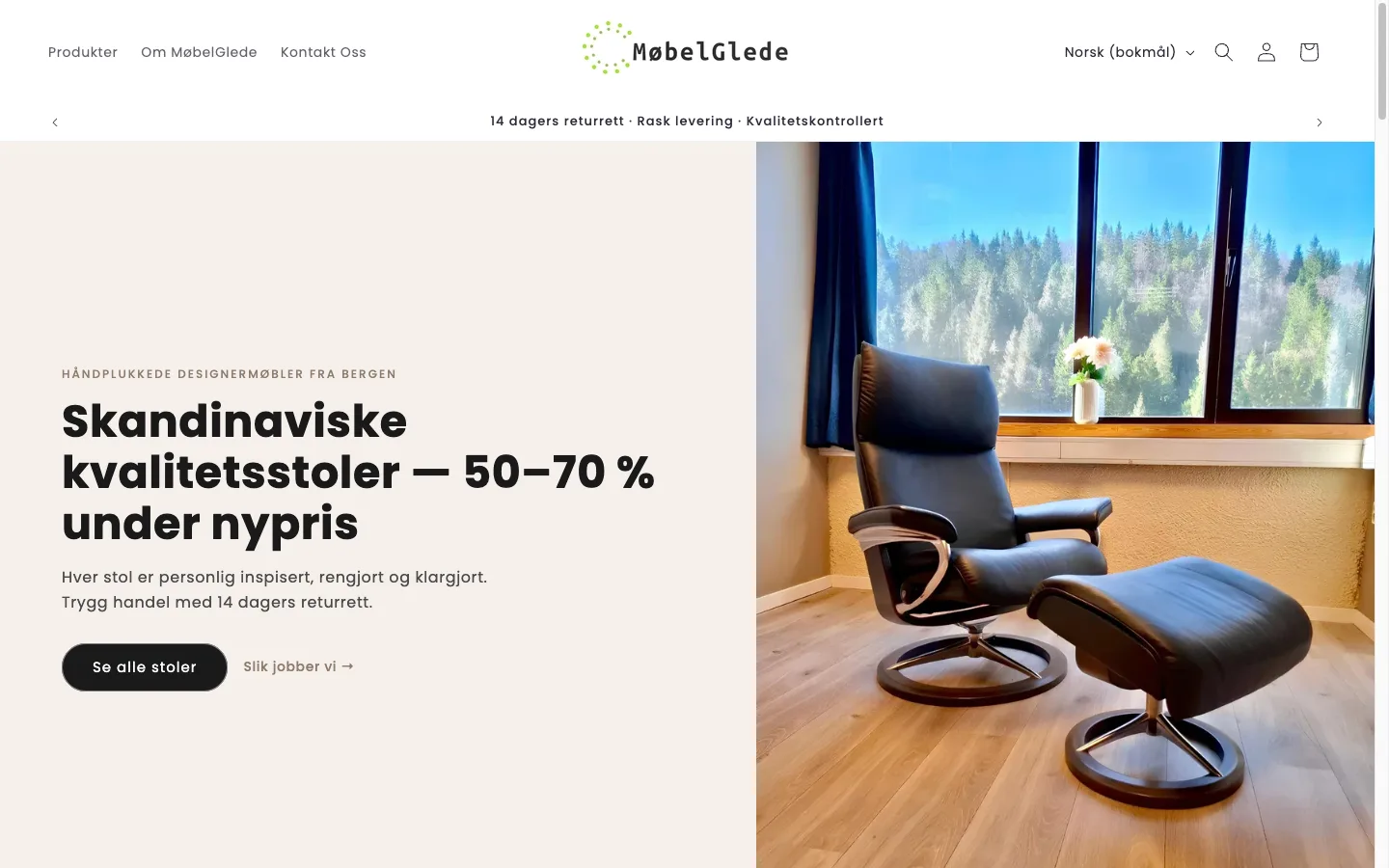
A Norwegian curated marketplace selling premium used and vintage Scandinavian furniture, including mid-century Danish teak dining sets, designer chairs, and other high-end pieces. Price points ranged from 5,000 to 30,000+ NOK (roughly $500 to $3,000+), with every item being one-of-a-kind. The store ran on Shopify’s Dawn-based Sense 2.2 theme.
75% of traffic came from mobile, with 56% of all sessions arriving through Meta’s in-app browser (FacebookApp), which has known issues with cookie support, tracking pixels, and page rendering. The store was spending on acquisition but converting almost nobody. Mobile CVR sat at 0.11-0.23%, with an ATC rate of 1.6% against a 5-10% benchmark. In a 3-day Clarity sample of 893 sessions (123 bots excluded), only 6 resulted in an add-to-cart. 94.74% of visitors were new users with almost zero returning customers. Average active time per session was 31 seconds.
The Audit: Microsoft Clarity Data
The 5-day audit produced 43 findings across homepage, PDP desktop, PDP mobile, cart, checkout, collection pages, and the about page: 15 critical, 19 high priority, and 8 medium. Before writing a single line of code, I installed Microsoft Clarity and collected behavioral data. The findings directed the entire sprint.
Scroll Depth - PDP Mobile (76 Sessions)
| Scroll % | Visitors Remaining | Drop-off | What’s at This Depth |
|---|---|---|---|
| 5% | 76 (100%) | 0% | Header + announcement bar |
| 15% | 69 (91%) | 9% | Product images |
| 30% | 60 (79%) | 21% | ATC button area |
| 50% | 50 (66%) | 34% | Trust icons + description |
| 70% | 40 (53%) | 47% | Accordion tabs |
| 80% | 38 (50%) | 50% | Related products |
| 85% | 11 (14%) | 86% | Contact form + footer |
21% of visitors never reached the ATC button. By the time 50% of visitors had left, they had not seen the description, trust signals, or related products. The page was too long for its mobile layout, and the ATC button was buried below oversized images.
Click/Tap Data - Popups Blocking Everything
| Rank | Element | Taps | % of Total |
|---|---|---|---|
| 1 | Cookie consent “Accept” | 23 | 23% |
| 2 | Omnisend email popup | 14 | 14% |
| 3 | Cookie consent “Decline” | 10 | 10% |
| 4 | Omnisend (second interaction) | 9 | 9% |
56% of ALL mobile taps were on cookie consent and email popups. Users were spending their sessions dismissing overlays instead of shopping. The cookie consent modal covered approximately 60% of the mobile viewport. The Omnisend popup was firing on product pages where it had zero signups. A persistent bottom bar for email notifications was blocking content on every page.
Session Recording Findings
- Users navigated in listing-to-PDP loops without adding to cart (rapid scanning behavior)
- Meta ad traffic spent time on product images but never reached the CTA
- Some users reached checkout but abandoned at the quantity/special instructions step
- Users visited the About page and Return Policy page multiple times, which is trust-seeking behavior indicating they wanted to buy but did not feel confident enough
The Implementation: 87 Commits Across 10 Tasks
The implementation was prioritized by the Clarity data. Popup fixes first (56% of taps wasted), then mobile PDP layout (21% drop before ATC), then trust signals, then collection page improvements.
P0: Cookie Consent and Popup Fix
The cookie consent modal was converted from a full-screen overlay to a small bottom-bar notice. The Omnisend email popup was disabled on product pages entirely (zero signups from PDPs, only tap-wasting). The persistent “Get notified about new items” bottom bar was removed from product pages via CSS scoping.
After this single change, 56% of mobile interaction was freed up for actual shopping behavior.
P1: Mobile PDP Layout Rebuild
Image height constraint. Product images were consuming the entire mobile viewport. Added max-height: min(55vw, 280px) with object-fit: contain to keep images proportional but not overwhelming. On a 390px iPhone, this saved roughly 220px of scroll depth.
Spacing cleanup. Removed dead whitespace above and below the image. Reduced margin-bottom from 3rem to 1rem on the product media list. These changes alone pushed the ATC button significantly higher in the scroll order.
Sticky ATC bar. Built an IntersectionObserver-based sticky bar that appears when the main ATC button scrolls out of view. The bar shows the current price and an Add to Cart button. It delegates clicks to the real form submit button (no duplicate form logic), syncs price updates via MutationObserver when variants change, and uses env(safe-area-inset-bottom) to avoid the iPhone home indicator. Hidden on desktop via media query.
Quantity selector hidden for single-unit items. Since every piece is one-of-a-kind, the quantity selector was unnecessary on 100% of products. Hiding it saved roughly 80px of vertical space and removed a confusing interaction for items that can only be purchased once.
Dynamic checkout button removed. The “Buy Now” button appeared alongside the ATC button as two equally-weighted black CTAs. For 10,000+ NOK purchases, dual competing buttons cause decision paralysis. Removed the dynamic checkout to leave a single clear primary CTA.
P1: Image Gallery Fix
The PDP had 13 images with no mobile thumbnail navigation. Users could only swipe with a “1/13” counter. Enabled mobile thumbnails via template JSON config change, then styled a horizontal scrollable thumbnail strip with scroll-snap-type: x mandatory. Added lightbox with prev/next navigation arrows.
P1: Trust Grid + Klarna + Accordions
New trust grid snippet. Built a 2x2 mobile grid (4-column on desktop) with 4 editable trust items: inspected by experts, 14-day return policy, free pickup in Bergen, and secure payment. Fully editable via theme editor schema blocks so the client can update text without code.
Klarna messaging. Added “Pay in 30 days, 0% interest with Klarna” line directly under the price. For items priced at 10,000+ NOK, installment framing changes perceived affordability without changing the actual price.
Accordion reorder. Moved the “Condition” accordion to first position and set it to open by default. Clarity showed users were trust-seeking, and condition is the primary qualifier for used goods. Putting it first and open addresses the biggest question immediately.
Condition badge above title. Rendered the product’s condition metafield as a colored pill badge above the product title on the PDP. Green for excellent, amber for very good, grey for good. Visible before scrolling.
Shipping info on PDP. “Home delivery 990 kr, PostNord 590 kr, Free pickup in Bergen” visible on every product page. Previously this information was hidden until checkout, creating a cost surprise that triggered abandonment.
P1: Meta In-App Browser Speed
56% of sessions came through Meta’s FacebookApp browser, which has no service worker support, limited caching, and slower JavaScript execution than native Safari or Chrome. Average Meta session duration was 16 seconds. The optimization focused on making the first paint show product image, title, and price within 1.5 seconds:
- Inlined critical above-fold CSS for the PDP (kept under 14KB for the first TCP round-trip)
- Deferred non-critical JavaScript (
animations.js,media-gallery.js,quick-add.js,share.js) - Applied
media="print" onloadpattern for non-critical CSS (cart drawer styles) - Set first product image to
loading="eager", all others toloading="lazy" - Constrained mobile product images to
width: 800instead of full-size - Added preconnect to
cdn.shopify.comand optimized Poppins font loading withfont-display: swap
P2: Savings Percentage Badges
Every product card showed a generic “Salg” (Sale) badge. Since 100% of products had compare-at prices set, the badge was meaningless visual noise. Replaced with a calculated savings percentage: (compare_at_price - price) / compare_at_price * 100, displayed as “-42%”. Products below 10% discount show no badge at all, making the remaining badges more meaningful.
P2: Condition Tags and Urgency on Cards
Condition badges on collection cards. Rendered the condition metafield as a colored pill overlay on each product card. Green/amber/grey matching the PDP badges. Shoppers can now scan a collection page and immediately see the condition of each piece.
“Kun 1 igjen” urgency labels. When inventory_quantity == 1 (which is every product since they are one-of-a-kind), show a stock urgency label. This is not manufactured scarcity. It is communicating a genuine inventory characteristic: if they wait, the piece will sell to someone else.
“New in store” label. Products created within 14 days get a “Ny i butikk” badge. Encourages repeat visits and creates a sense of freshness.
P2: Cart Trust Elements
The cart drawer had zero trust signals and no shipping cost visibility. Added a trust bar between the totals and checkout button showing secure payment, 14-day return policy, and payment method icons. Added shipping cost disclosure directly in the cart: “Home delivery 990 kr, PostNord 590 kr, Free pickup in Bergen.” Hid the quantity selector in cart for single-unit items (static “1” instead of +/- controls). Removed the order notes field to reduce friction.
The cart drawer went through multiple design iterations (3 full rebuilds across 10+ commits) to achieve a luxury-grade layout appropriate for 15,000 NOK furniture.
P3: About Us Redesign
Clarity recordings showed users visiting the About page multiple times. This is classic trust-seeking behavior: they want to buy but need to know who they are buying from. The original page failed the “skeptic test” with no company org number, no showroom photos, and no founding story.
Built a new fully-editable About section with schema blocks for: showroom photo (image picker), founder story (rich text), “How we work” process steps (repeatable blocks), and company details (text settings including org number). All editable by the client in the theme editor.
P3: Homepage Restructure
Replaced the AI-generated hero images and redundant slideshow with a single static hero using a real product photo. Restructured the homepage as a trust-first conversion funnel: announcement bar with rotating trust messages (“Quality-checked by experts”, “14-day return policy”, “Free pickup in Bergen”), followed by featured products, then social proof.
Removed the purple brand colors and replaced with a black/white Scandinavian aesthetic that matches the furniture being sold.
Reviews Section on PDP
Built a customer reviews carousel section that renders on home, product, and about pages. Reviews are entered as repeatable blocks in the theme editor (no external app dependency). Each block contains reviewer name, star rating (SVG star system), review text, and date. The client populates reviews from SMS and Google review screenshots. Social proof was the final trust gap identified in Clarity recordings.
FAQ Page with Structured Data
Built a reusable FAQ accordion section with FAQPage JSON-LD schema auto-generated from the block content. Deployed on both the dedicated FAQ page and the contact page. Default content covers the 6 most common buyer questions in Norwegian: condition categories, shipping, returns, payment methods, Bergen pickup, and inspection process. Schema validates in Google Rich Results Test.
Additional Implementation
- FAQ accordion styling matched to existing PDP accordion design
- Customer reviews carousel section added to home, product, and about pages
- Premium dark footer with 5 tiers: trust bar, newsletter, navigation, payment icons, legal
- All filter labels translated to Norwegian (Availability, Price, etc.)
- Lightbox zoom with proper fit-to-screen on all devices
- Return policy contradiction in FAQ fixed (found during QA)
Technical Constraints Followed
Every commit followed these rules:
- No
!importantin CSS. Solved specificity correctly. - Vanilla JavaScript only. No jQuery, no external libraries.
- Lightweight transitions only. No heavy keyframe animations.
- All text in Norwegian. All prices via
| moneyfilter. - Every new section fully theme editor editable with
{% schema %}blocks. - One task per commit, one commit per push.
Key Takeaway
The 0.11% conversion rate was not a traffic problem or a product problem. It was a trust and friction problem diagnosed precisely by Microsoft Clarity data. 56% of mobile interaction was wasted on popups. 21% of visitors never saw the ATC button. Zero trust signals existed on the PDP. Shipping costs were hidden until checkout.
The fix was not a redesign. It was a systematic, data-directed sprint: remove the friction blocking interaction (popups), move the purchase action into view (sticky ATC + layout fix), build confidence at every decision point (trust grid, condition badges, Klarna, shipping costs), and give the collection pages information density that helps shoppers evaluate items faster (savings percentages, condition badges, urgency labels).
87 commits. 10 tasks. Every change traceable to a specific data point from the CRO audit. For the technical details on sticky ATC implementation, popup conversion impact, and savings badge Liquid code, see the linked blog posts.
For comparable trust-led work on other premium catalogs, see the Enea Studio engagement for technical SEO and Core Web Vitals on luxury jewelry, or the WD Electronics audit for high-ticket UTV accessories with checkout sticker shock.
Phase 1 Results (Mar 14 - Apr 12 vs Feb 10 - Mar 12, 2026)
The 87-commit sprint moved every funnel metric.
| Metric | Change |
|---|---|
| Add-to-Cart | +41% |
| Checkout | +40% |
| Total Sales | +51% |
Add-to-cart and checkout roughly track each other, which means the cart and checkout flow worked: the buyers who got past the popups and reached the ATC went on to convert at the same rate they always could. The 51% sales lift came from removing friction at the top of the funnel, not from any one heroic checkout fix.
Phase 2: Traffic Quality (April 2026 onward)
After Phase 1 closed the on-site leaks, the data exposed a new bottleneck: traffic quality.
- 61% of traffic from Meta with only 17 seconds average engagement.
- 48.6% of all sessions arrive through the Facebook in-app browser (FacebookApp). Casual scrollers, not buyers.
- 13.5% of sessions confirmed bot traffic.
- Google referrals, by contrast: 72.7% engagement rate, 1m 6s average time, highest conversion rate.
The site is no longer the bottleneck. The campaign is. The Meta campaign was likely optimized for link clicks rather than purchases, which causes Meta’s algorithm to send the cheapest (lowest-quality) traffic. Phase 2 was scoped as project-based work to move budget from cheap traffic into qualified buyers.
Phase 2 scope
| Workstream | Type | Why it matters |
|---|---|---|
| Meta Ads Audit & Restructure | One-time | Single biggest leak in the funnel. Audit objective, audiences, placements, creative-to-LP alignment, bot traffic elimination. |
| Google Ads + Merchant Center Audit | One-time | Google visitors already convert higher than Facebook. Audit 3 existing Google Search campaigns, fix 33 Merchant Center products (25 limited, 8 not approved), repair Enhanced Conversions tracking errors. |
| SEO Foundation | One-time | Organic search delivers 9.4% of traffic but the highest-quality visitors. Build a long-term, free traffic source. |
| Sales Funnel Monitoring | Monthly retainer | Weekly funnel tracking via Shopify Analytics + GA4 + Microsoft Clarity. Catch problems early, measure every change. |
| Coaching Sessions | Monthly retainer | Owner wants to understand the why and how, not just have the work done. Build the merchant’s ability to read dashboards independently. |
The recommended starting point bundles Meta + Google Ads work as the fastest revenue impact. SEO Foundation runs in parallel since organic compounds over months, not weeks. The two retainers (monitoring + coaching) keep the merchant in the loop on every change and surface the next-highest-impact item every week.
What Changed for the Merchant
The cookie consent and Omnisend popup fix alone freed up 56% of mobile interaction for actual shopping behavior on the same day it shipped. The mobile PDP rebuild moved the ATC button into the first viewport so the 21% of visitors previously dropping off before they ever saw the CTA now had a path to convert. Combined with the trust grid, condition badges, Klarna installment messaging, and shipping cost transparency on every PDP, the store now has the trust scaffolding a 5,000 to 30,000 NOK furniture buyer needs in order to commit on a one-of-a-kind piece they cannot touch first. Phase 1 results: ATC +41%, checkout +40%, total sales +51%. Phase 2 takes on the upstream traffic-quality problem so the rebuilt site stops getting filled with bots and casual scrollers.
Running a high-ticket or used goods Shopify store with conversion challenges? Book a free strategy call. I specialize in the trust and friction problems that standard CRO advice does not cover.