

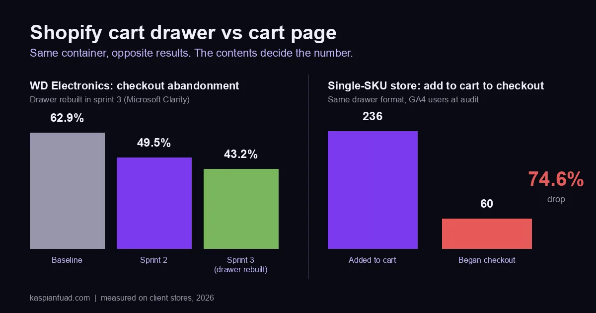
TL;DR: A cart drawer does not convert better than a cart page, and a cart page does not convert better than a drawer. On WD Electronics a rebuilt drawer cut checkout abandonment 6.3 points in a week. On a single-product brand a drawer lost 74.6% of add-to-cart users. The container is not the lever. The contents are, and I show you what to put in yours.
In the last week of April I rebuilt the cart drawer on WD Electronics, a Shopify Plus store where Derek Burgener sells $400 to $2,000 UTV lighting and accessory kits. Checkout abandonment went from 49.5% to 43.2% in that one sprint, on top of a 13-point drop the sprint before. By June, cart page CLS had gone from 0.488 to 0.001.
Two months earlier I had watched a drawer do the opposite. A DTC water bottle brand selling one GBP 30 hero SKU had 236 users add to cart and 60 begin checkout. The drawer was the leak.
Same format. Opposite result. Most page-one answers to “cart drawer vs cart page” come from cart-app vendors telling you the drawer wins, and none of them publish a before-and-after. Below is the version with the numbers.
Download the Shopify Cart Decision Sheet (PDF)
Why this matters for your store
- The step between add-to-cart and reached checkout is where most Shopify stores lose the most buyers, and it is the step the checkout blogs never cover.
- On a $450 average order, a 6-point drop in checkout abandonment across 700 reached checkouts is about 42 extra orders, roughly $19,000 in revenue.
- Every cart app you add to fix it costs blocking time on mobile, and the drawer apps I measured run 80ms to 140ms each before your theme does anything.
Does a cart drawer or a cart page convert better on Shopify?
Neither, on its own. I have shipped both, on stores from used furniture to UTV parts, and the format has never been the thing that moved the number. What moved it was what the buyer saw in the first second after tapping Add to Cart.
Baymard’s usability research says the same thing in calmer words. In its added-to-cart confirmation testing, shoppers accepted “an overlay, a drop-down cart, or an in-between page” as long as the confirmation made the path to their next step obvious. Their failures came from ambiguous paths inside the confirmation, not from the choice of container.
Ask ChatGPT the same question with web search on and it cites Baymard and shopify.com, then admits there is no strong independent evidence that a drawer universally converts better. It is right. There is none, because the vendors who rank for the query sell drawers and measure nothing.
So here is the decision rule I use instead of the vendor answer.
| Store shape | What I ship | Why |
|---|---|---|
| Multi-item catalog, considered purchase ($200+) | Drawer, rebuilt to the checklist below | Buyers add two or three items and want to confirm without leaving the page |
| Single hero SKU, impulse price, paid social traffic | No cart step at all; Add to Cart goes to checkout | The decision was made on the PDP, every extra tap is a lost order |
| Carts that need a decision: shipping options, quotes, configurator items, B2B | Full cart page | The buyer needs width and time to review before committing |
| Anything with a heavy drawer app and a poor INP | Theme-native drawer, app removed | The app’s blocking time was the problem, not the layout |
The stores below are the evidence.
Why did a rebuilt drawer cut checkout abandonment 6.3 points?
Because the old one hid the checkout button.
WD Electronics sells UTV accessories to enthusiasts who research for weeks. The catalog runs $200 to $2,000 and the average order sits around $450. That is the considered-purchase row of the table, so a drawer was the right container. The drawer they had was the wrong one.
On a 375 pixel viewport the Secure Checkout button sat below the fold. A buyer added a $578 turn signal kit and saw a subtotal and a scroll bar. The Remove control was too small to hit reliably on the first try. Microsoft Clarity logged 22 rage clicks, repeated taps in one spot in a short window, across the site in the baseline period and quick-back clicks on 13.31% of sessions.
The rebuild was theme code, not an app:
- Sticky footer layout. The drawer became a flex column with the subtotal and the Secure Checkout button pinned to the bottom, always above the fold at 375 by 667.
- A 36 by 36 pixel Remove target, above the WCAG 2.5.8 minimum of 24 CSS pixels, with the tap area padded rather than the icon enlarged.
The week that shipped, checkout abandonment went from 49.5% to 43.2%. Mobile sessions were up 19% the same week, so the drop was not a quiet-week artifact. Across the three sprints together, rage clicks went from 22 to zero and quick-back clicks from 13.31% to 0.36%.
Two more cart findings from the audit went into the roadmap rather than that sprint. The upsell widget had suggested a $698 kids ride-on to a turn-signal buyer, and package protection was arriving at checkout as a silent $29.97 line that turned a $578 kit into $607.97. Both are on the checklist below because every drawer I audit has a version of them. On the 4-week rolling funnel through early June, reached checkout rate was up 30% and added to cart up 28% on sessions up 4%.
Later in the retainer I fixed the last cart problem, which was not in the drawer at all. The free-shipping progress bar on the cart page was injected by JavaScript after load, pushing the whole cart list down. Lighthouse cart CLS was 0.488, nearly five times Google’s 0.1 threshold. A server-rendered bar and a reserved list height took it to 0.001. Field readings on /cart after sprint 3 were already inside Google’s good band, LCP 1,105ms, INP 69ms, CLS 0.05, and the lab fix closed the last gap for the users who did see the shift.
A bar built correctly is a Liquid section, and I published the free shipping progress bar code I use for it.
When does a cart drawer lose you sales?
When the buyer has already decided and the drawer asks them to decide again.
HelloSips sells one GBP 30 water bottle, almost entirely to paid social traffic on phones. GA4 showed 236 add-to-cart users and 60 begin-checkout users in the period I audited, a 74.6% drop at a step where 30 to 50% is normal. The drawer opened with product details, a quantity stepper and a Proceed to Checkout button sitting below the fold on a 375 pixel screen.
For a GBP 30 impulse buy that extra tap was fatal. The ads buyer put it in one line in Slack: “When he clicks once, directly to the checkout page.” I wrote the full diagnosis in the five cart leaks hiding in Shopify. The fix I specified was to send the Add to Cart button straight to checkout with the cart attributes set, and to make Shop Pay the loudest button on the page.
Two things about that store generalize.
First, the second leak was the same drawer showing GBP 120 for one bottle, because a bundle app was multiplying the quantity. A drawer is the first place the buyer sees the real total, so any pricing bug lands there. Check it on a real phone before you ship anything.
Second, Dawn does not default to a drawer. The Cart type setting in Theme settings offers Drawer, Page or Popup notification, and Dawn’s settings schema sets the default to notification, a small popup that confirms the add and offers a checkout button. For a single-SKU store that popup is closer to right than the drawer most merchants switch on in week one.
What belongs in a Shopify cart drawer for a considered purchase?
Seven things, in this order from top to bottom. This is the checklist I rebuilt WD Electronics to, and the same one I used across three drawer rebuilds on Mobelglede, a Norwegian furniture marketplace selling 15,000 NOK pieces.
- The line item with the decision confirmed. Image, title, the variant, and the thing the buyer worried about: the vehicle it fits, the size, the finish. On a UTV store that is the vehicle it fits, because fitment is the number one pre-purchase question and the reason SuperATV badges every product card.
- Shipping, in money. Mobelglede’s drawer had no shipping information at all. Adding “Home delivery 990 kr, PostNord 590 kr, free pickup in Bergen” directly in the cart was part of a sprint that lifted checkouts 40% and sales 51%. Baymard’s 2026 abandonment survey puts extra costs at 40% of abandonment reasons, the largest single cause.
- Fees as an opt-in, never a silent line. Package protection, tip, gift wrap. If the buyer did not tick it, it is not in the total.
- The installment amount for orders over about $300. “Or 4 payments of $144.50” under a $578 subtotal changes how the number feels without changing it.
- A trust line with the payment marks and the return window. Mobelglede’s drawer got secure payment, a 14-day return, and the card logos between the totals and the button.
- A remove control you can hit on the first try, at least 24 by 24 CSS pixels, and a quantity stepper only where multiples make sense. For single-unit furniture I replaced the stepper with a static “1”.
- The checkout button pinned above the fold at 375 by 667, with the upsell block below it, not above it.
Everything else, the note field, the discount code box, the announcement, the rewards bar, goes below the button or on the cart page. A drawer’s job is to confirm and move. A cart page’s job is to let someone think.
How much does a cart drawer app cost in speed?
More than the drawer is worth on most stores.
I measure the main-thread blocking time of Shopify apps for my App Speed Index, and the cart category is a middleweight. UpCart runs about 80ms and Rebuy Smart Cart about 140ms of blocking time on a typical PDP. Lighthouse flags any third-party script that blocks the main thread for more than 250ms, and Google’s INP threshold is 200ms per interaction, so a 140ms drawer app spends most of the mobile budget before the theme’s own JavaScript runs.
The drawer’s open animation is the interaction that shows it. On a Shopify Plus store with a p75 INP of 612ms, the second-worst long task was the cart drawer at 220ms: a CSS slide-in, a /cart.js fetch and a DOM re-render all firing on the same click. Running the render after the transition, with the freshness fetch in requestIdleCallback, took that interaction from 220ms to 62ms. That was theme code, and it was free.
A theme-native drawer costs 0ms of app blocking time and no monthly fee. On Tuff Pupper, a DTC dog gear brand, the cart-aware add-on rail under the free-shipping bar is a native cart-drawer modification, no app, and it hides itself the moment the cart crosses $35. If you are paying for a drawer app to get a free-shipping bar and three upsells, you are paying twice: the subscription and the blocking time.
How do I know which one my store needs?
Run one division before you touch the theme.
Open Shopify analytics and read two fields: added to cart rate and reached checkout rate. Shopify defines both as sessions with the action over all sessions, so they are directly comparable. Divide reached checkout by added to cart.
Above 0.6 and your cart is doing its job; look at the checkout and the product page instead. Between 0.4 and 0.6 and the contents need the seven-item pass above. Below 0.4 and the container itself is in the way: on HelloSips the ratio was 0.25, and the answer was to remove the cart step entirely for that product.
Then open the cart on a real 375 pixel phone, not in the theme editor preview. Add the most expensive item. If you cannot see the checkout button without scrolling, that is fix number one, whatever your ratio says.
If you want it done rather than diagnosed, this is a two to three day fix on most themes. Send me the store URL through the contact form and I will reply with the three things I would change in your cart first, which is the same read I did for Derek before the sprint started. The CRO retainer post shows what the ongoing version costs and what a month of it produced on WD.
How to verify in 5 minutes
Open Shopify analytics for the last 28 days and note added to cart rate and reached checkout rate. Divide the second by the first and write the ratio down. Then run Lighthouse on your cart page URL on mobile and read CLS; anything over 0.1 means the cart is moving under the buyer’s thumb. Finally, add your priciest product on your own phone and count how many taps and scrolls it takes to see the checkout button. One tap and zero scrolls is the target.
The takeaway
- Stop asking drawer or page. Baymard’s testing and both of my measured stores say the container does not decide the number.
- Match the container to the order shape: drawer for considered multi-item carts, straight to checkout for single-SKU impulse buys, a page when the cart needs a decision.
- Pin the checkout button above the fold at 375 pixels; the WD rebuild’s 6.3-point drop came from that and a Remove control a thumb can hit.
- Show shipping and fees as money, as opt-ins, before checkout, because 40% of abandonment is extra costs.
- Measure the drawer app’s blocking time before you keep it; 80ms to 140ms per app is most of the mobile INP budget.
I am Kaspian Fuad, a Shopify developer and CRO consultant. I rebuild carts in theme code, measure the reached-checkout rate for four weeks after, and publish the numbers. If your add-to-cart rate is healthy and your reached-checkout rate is not, book a call and bring the two fields above.